
Firehouse Brewing Company
NEW BREWS FOR SOUTH DAKOTA’S
OLDEST BREWERY
BRAND DESIGN
PACKAGING
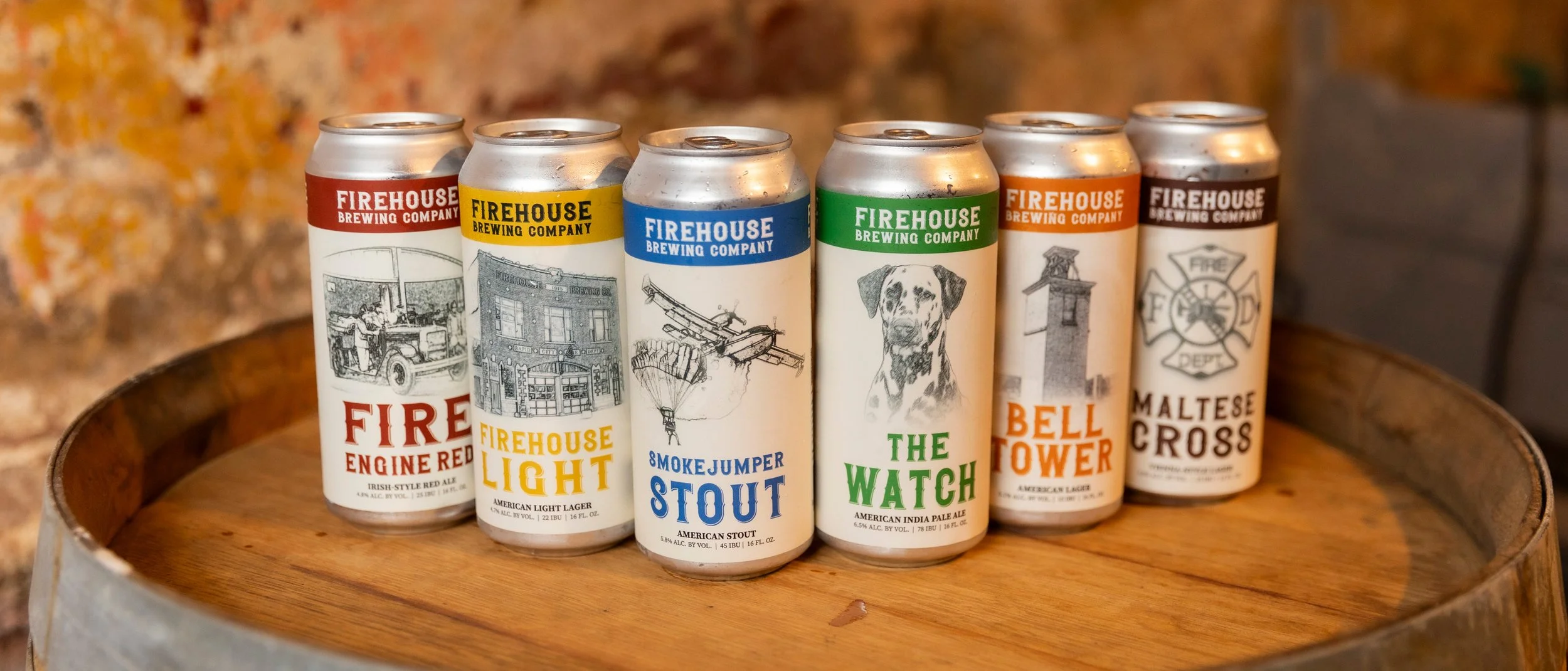
Firehouse Brewing Company is a brewery and American Restaurant housed within a local, historical landmark of what used to be Rapid City’s Fire Department that was originally built in 1915.
Welcoming a new brewer to it’s operations, I worked directly with both the head brewer and CEO to create a new look for their packaged beer cans that celebrates the history of Firehouse with modern elements.
The result deliverables included series of cohesive designs for each of their core brews for both traditional label printing and sublimation printing methods, while ensuring designs are TTB compliance for distribution.
Client satisfactory lead to additional, promotional designs, such as a special summer release and an additional design of a product made in collaboration with another local brewery.
Overview
Services
Brand Design
Package Design
Personality
Transitional
Rustic
Historical
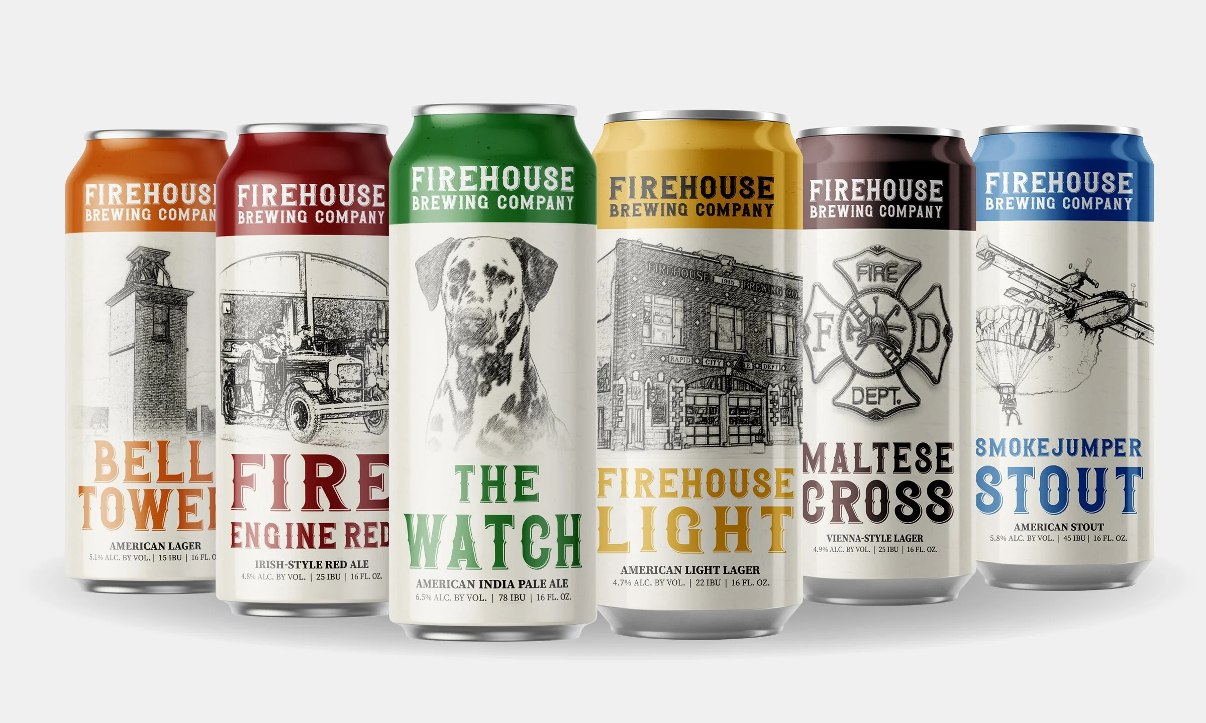
The core lineup features the brewery’s main products for distribution.
Once the initial design template was created, each individual product was color coded to emphasize the different brews crafted from the same brewery for quick brand association by consumers.
Historical photos were used and manipulated for print production for each can in honor of the brewery’s historic landmark.
Package Design
For Core Brew Lineup
BRAND DESIGN
PACKAGING
Summer Edition
Package Design
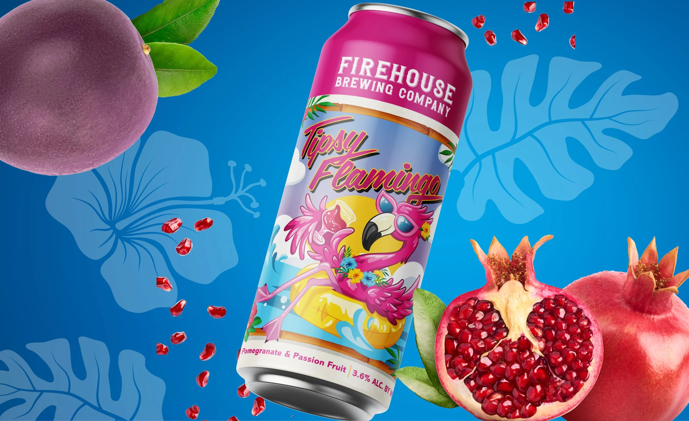
The Tipsy Flamingo became additional design request to feature a new sour ale for a seasonal brew that quickly became a more permanent staple for both the brewery and restaurant.
Working closely with the headmaster brewer, we created a more modern design with a custom illustration. Design elements were closely discussed in collaboration with the brewer to deliver a new design template for special releases.
PACKAGING
Two Breweries, Two Releases,
One Brew
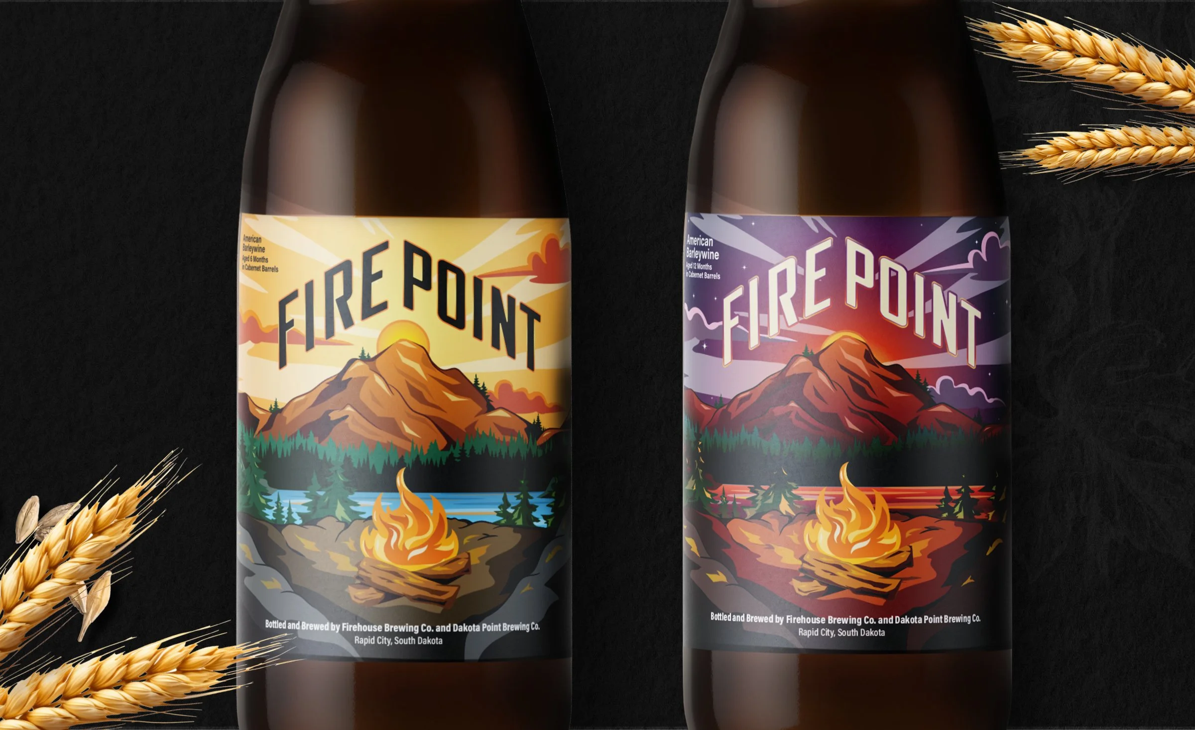
When Firehouse Brewing Company made plans to create a special release in collaboration with another local brewery, additional package design was requested for production.
As a barrel aged beer, two releases were planned: one at 6 months, and the other at 12 months. This opportunity gave rise to an elevated level of design. While the brief involved creating a landscape illustration, I initiated the idea to honor the aging process between the 6 and 12 month releases.
The first release captured the landscape at the golden hour, the beginning of a sunset, while the second release incorporated darker shades of the same landscape, the last light of the sun as it gives away to dusk.
PACKAGING