Abbott House Youth Services
New Horizons For a non-profit
Expanding service capabilities for TODAY’S youth in need
BRAND DESIGN
WEB DESIGN
CREATIVE CAMPAIGN
The Abbott House is an organization who has provided a place of hope and healing for thousands of children since 1938. It recently renamed the non-profit organization to Abbott House Youth Services after acquiring the operations and assets of another youth organization, Wellfully. This acquisition of services and space led to the need to not only update their logo, but acquire a new brand identity.
Without any form of previous brand standards in place, our goal was to create a new identity with a comprehensive guidebook that details how to professionally, and consistency maintain proper branding throughout all forms of communications for both staff and board members.
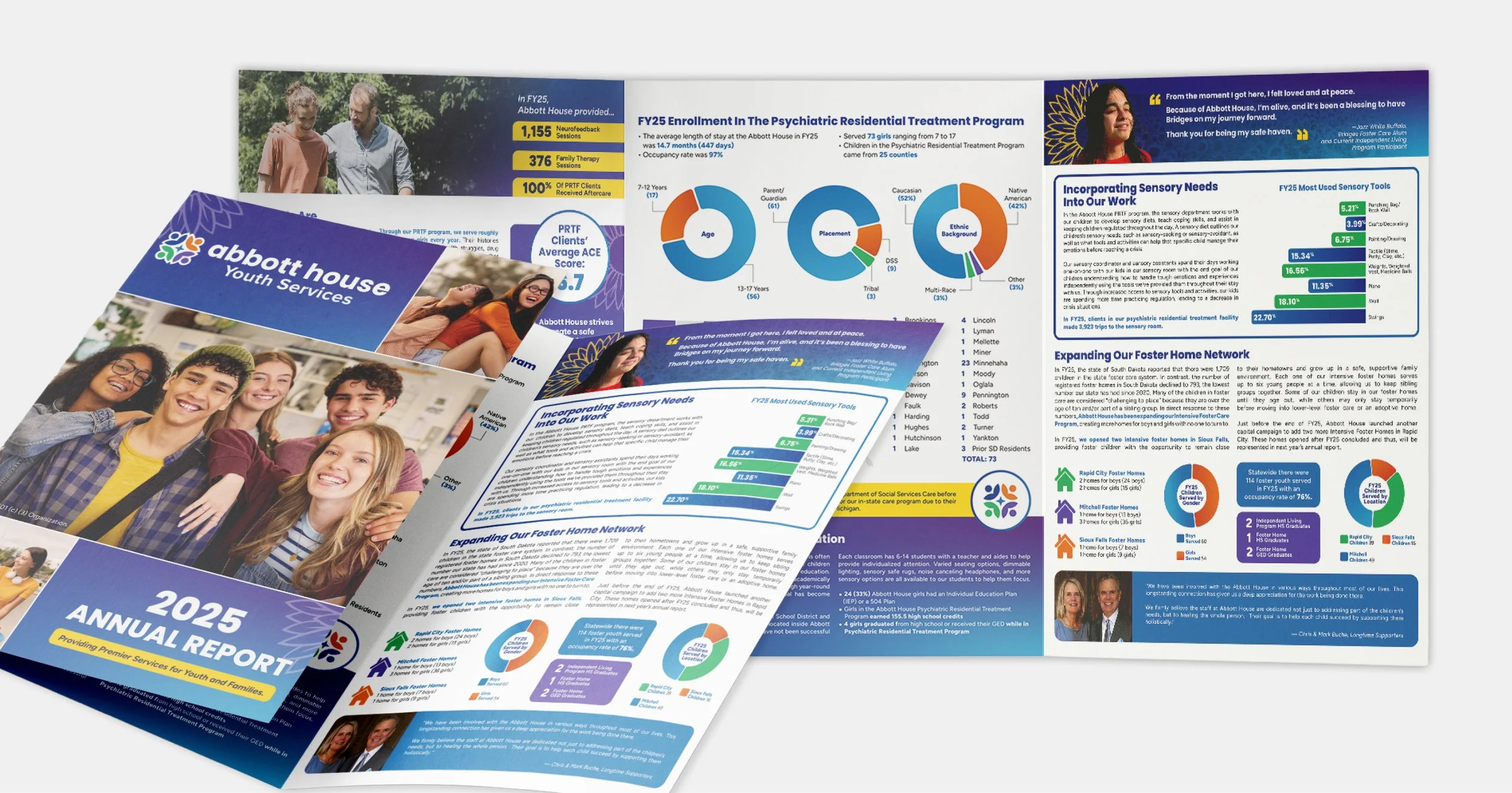
Successful deliverables include a full logo suite, including sub brand marks that highlight their specific services, a complete brand guidelines kit, a public announcement of both the new logo and the acquisition, and an annual report mailed out to key stakeholders with the new brand identity set in place. Additional digital ad sets were also created for internal recruitment needs.
Overview
Services
Logo Design
Website Design
Video
Digital Ad Sets
Annual Report
Personality
Inspirational
Human-Centric
Hopeful
Compassionate
Encouraging
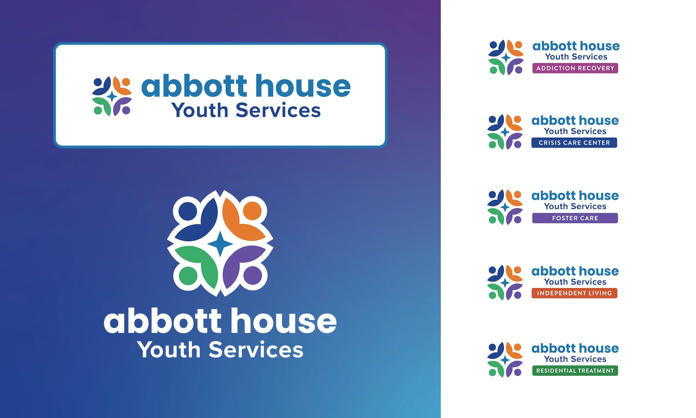
Since the original logo included a generic flower, we expanded their origins by specifically utilizing sunflower imagery, a flower symbolic of their resilience in their ability to thrive in harsh weather conditions; an idea to encourage the same value for the organization as they support youth during their own challenges and adversities.
The logo features an abstract icon by combining petals to make an individual, reinforcing the human-centered services along with growth and hope.
Additional colors were also incorporated to represent the services provided, especially with the new acquisition of WellFully. This will be further incorporated into the new brand, with opportunity to incorporate in their sub brand marks.
Logo Design
BRAND DESIGN
Brand Guidelines Kit
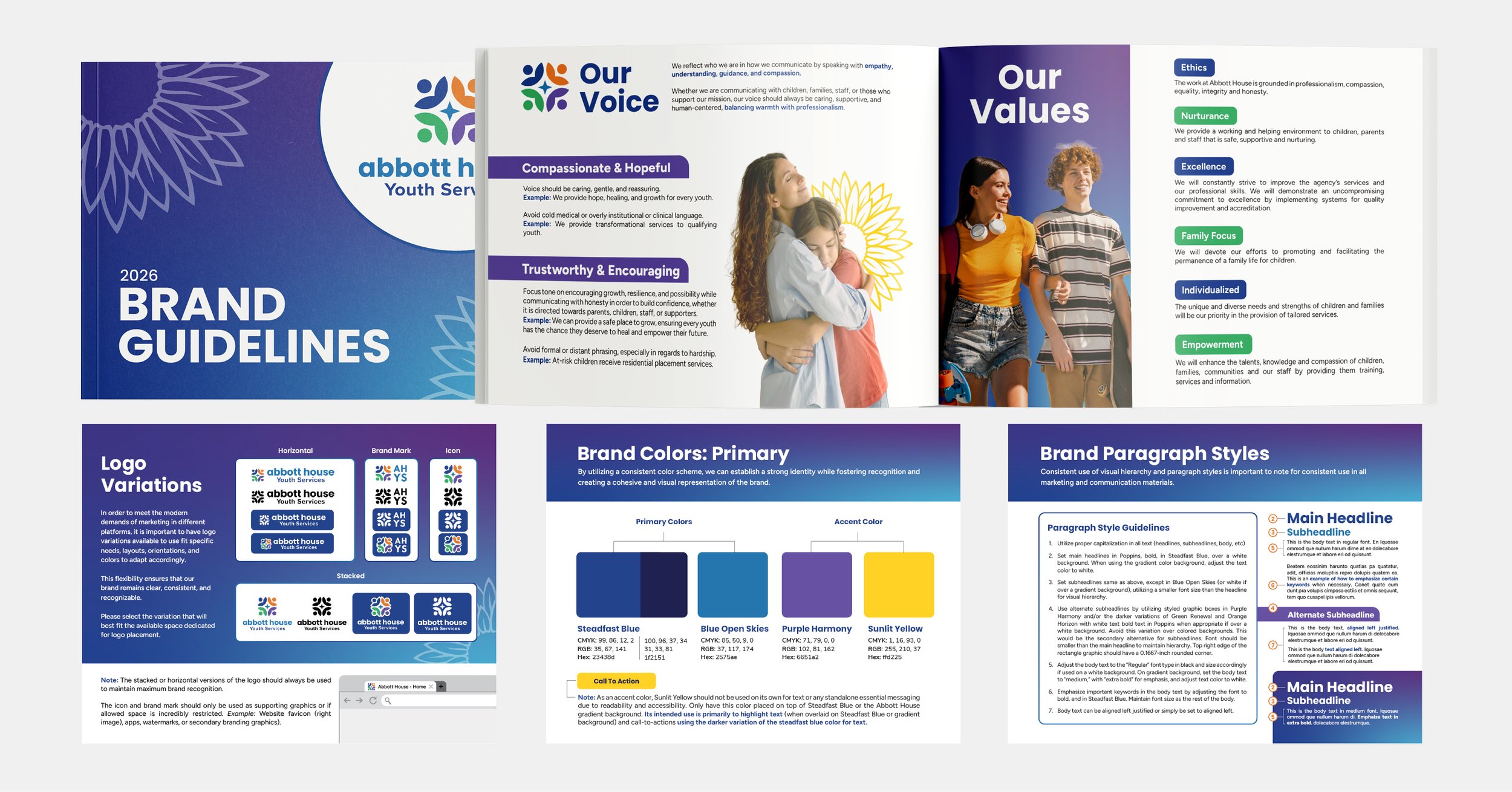
This kit serves as a complete, and comprehensive guideline on how to create marketing materials and assets professionally, consistently, and accurately, reflecting the new identity.
It serves to build trust and strengthen recognition with clarity and consistency on topics such as proper logo usage, color palette, typography, paragraph styles, and imagery.
In addition to the guide book, other deliverables include files of essential design elements, such as logos, icons, and gradient patterns; everything that an internal marketing team would need.
BRAND DESIGN
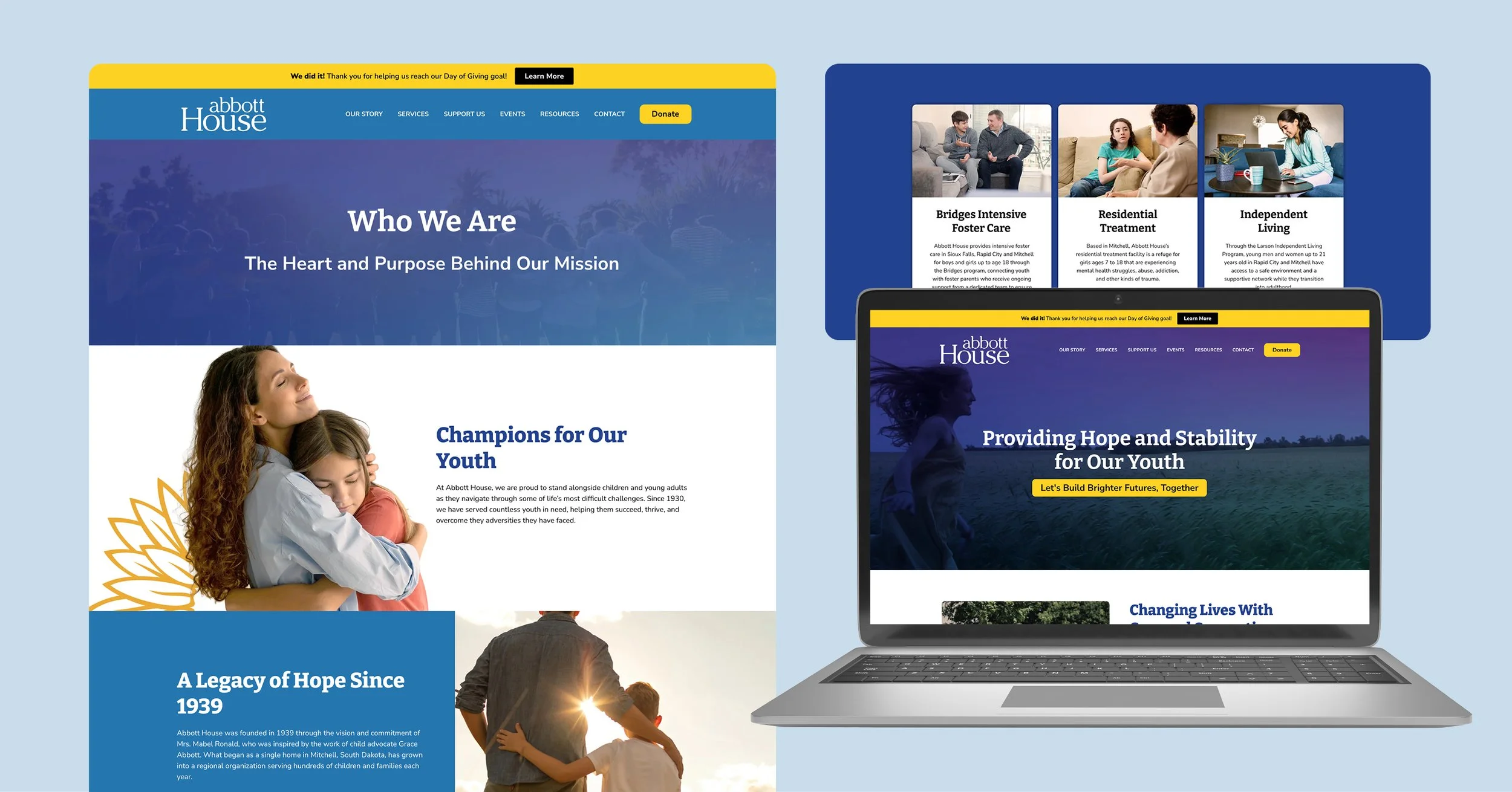
Website Design
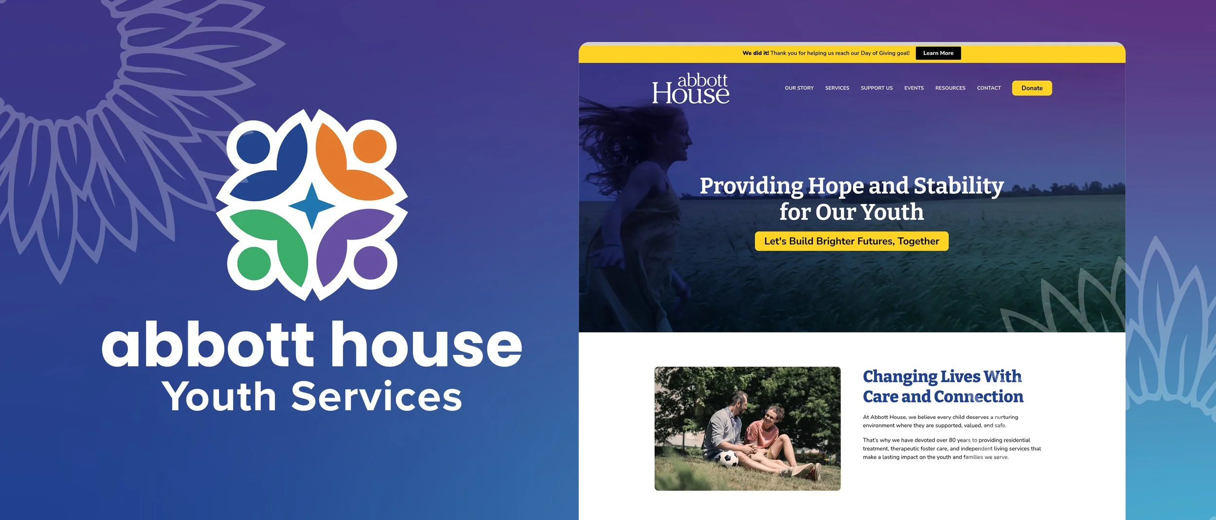
A new website was designed and developed, incorporating a new brand identity.
We overcame one of their pervious challenges with photography. To the protection of privacy of the youth serviced, outdated stock images were relied on.
We compiled an improved image library with quality imagery depicting hope, compassion, and empathy to better align with their values and work.
This new identity would be incorporated into all new marketing materials, with plans to recreated old, existing materials.
Color palette was checked to ensure it meets Web Content Accessibility Guidelines (WCAG).
WEB DESIGN
BRAND DESIGN
Creative
Campaigns
For social media, a video of the exciting brand reveal and the announcement of their expansion was created.
Other social media graphics, both static, and video, were created to promote recruitment opportunities.
BRAND DESIGN
CREATIVE CAMPAIGN
Print Materials
The annual report that is mailed out to thousands of stakeholders was the perfect opportunity to bring the new brand to their front door.